Cara Byrne, PhD is a lecturer in English at Case Western Reserve University
In her 2018 Astrid Lindgren Memorial Award acceptance speech, children’s book writer and 2020 MacArthur Fellow Jacqueline Woodson specifically uses the color “gray” to describe “the time we are living in in the US.” She explains that she mindfully avoids words like “dark” or “black” to describe something negative, as she took this usage personally as a child. Woodson explains: “I am dark. I am black. Why should who I am be negative?”
Colors are often used colloquially to describe feelings, attitudes, and even worldviews, but Woodson challenges us to think carefully about how even a flippant response about one’s mood can dehumanize and harm others. As a children’s book writer, she is particularly in tune with how early depictions and descriptions of color can shape a child’s understanding of the world, even as colors are used in picture books to depict non-human forms.
As the We Need Diverse Books and #OwnVoice movements have pushed the children’s book industry to be more mindful of representation of children of different racial backgrounds, they have also inspired conversations about how subtle racist cues permeate the pages of picture books. Children’s literature publishers, creators, scholars, and readers have noted depictions of the color black with increased attention over the last couple of years – even leading to revision of picture books.
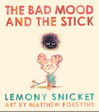
In April 2017, the publisher Little, Brown tweeted a tease of the cover image of their newest picture book titled The Bad Mood and the Stick, which features the curious image of an angry young girl wielding a thin brown stick in her hand while a bad mood lurks above her. While some responded to this tweet with their excitement for another picture book by Lemony Snicket, the author of the popular “A Series of Unfortunate Events” middle grade novels, this tweet also created criticism from some who saw resemblances between the bad mood and nineteenth century racist caricatures.
Instead of seeing a humorous new book, they saw that the personified bad mood that hovered over the pale-faced protagonist was a black ball with frizzy lines, reminiscent of demeaning black-faced caricatures that have plagued the genre of children’s literature since the early nineteenth century.
Librarian Edith Campbell replied to the publisher’s tweet and wrote a blog entry critiquing the illustration, asking why the bad mood was colored black instead of blue or gray, and asserting: “I am Not Your Bad Mood.” She states: “I hate feeling like the book police” but “I’m a grown woman and couldn’t help but take that image personal, to feel that this is what people think of me, that I am your bad mood. And if I feel that, I feel the need to protect children from it. Why is this bad mood black?”
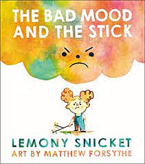
Instead of ignoring Campbell and the voices of those who found the image problematic, Little, Brown promptly apologized and tweeted: “We appreciate your valuable feedback and sincerely apologize that these images were offensive. They will be changed.” Between the time this was tweeted on April 28, 2017 and Kirkus published its glowing review of the picture book on August 21, 2017, the picture book was re-illustrated by Matthew Forsythe and the bad mood appearing on the cover went from a small black ball over a white child’s head to a much more massive, rainbow-hued angry mass. The book went on to be published in November 2017.
This groundbreaking response is indicative of a larger shift that is occurring in the picture book genre, one that pays closer attention not only to the way color can influence how a book is read but also to the calls of bloggers, those on Twitter, and scholars and students whose voices would not have been taken as seriously or even heard 10 years ago.
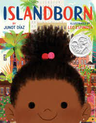
Like The Bad Mood and the Stick, Anisfield-Wolf award winner Junot Diaz’s first picture book “Islandborn” came under scrutiny for how illustrator Leo Espinoza presents the central antagonist of the book. The large “monster” that is used to represent the oppression that the protagonist’s family and neighbors faced while living on an unnamed island before immigrating to another country was initially illustrated as black.
Diaz writes of this monster (and the island) in relatively vague terms because he “was hoping this book wouldn’t just be a comment on little Lola and her lovely family and this larger island community from which she comes” and he “was hoping it would also be something of a dialogue about what children’s literature is capable of.” He explained that the monster “represents the savage, traumatic histories from which many of us immigrants emerge—a history that is often erased or silenced within our communities and inside of the community in which we find ourselves.”
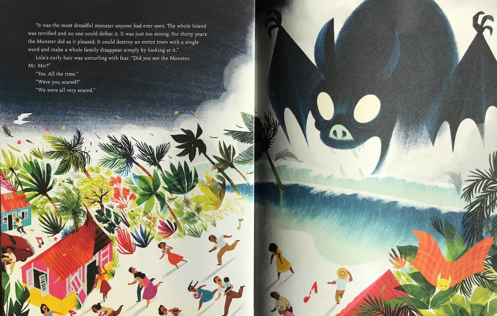
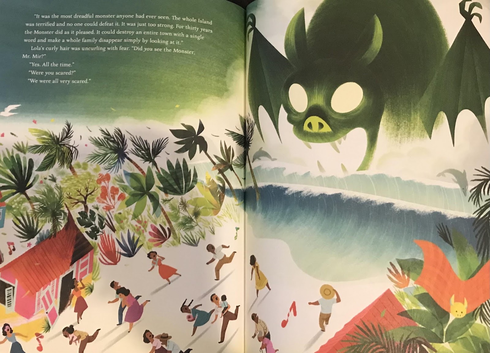
When Espinosa, a Colombian illustrator created a companion image to reflect this nuanced monster, he chose to make it bat-like, intimidating, and black. Early reviewers did not critique the way the monster was shaped, but some pushed against the use of the color black. When Teaching for Change published a pre-publication review, they were dismayed about this artistic choice.
They asked: “Why give children, one more time, the message that black is bad and scary? Especially when that monster is supposed to represent Trujillo who was light skinned and persecuted countless people, most notoriously those who were black.”
While this blog post could have gone unnoticed, once again, the publisher Dial responded quickly by stating that they were pulling printed copies of the books and revising this aspect of the book in order to “meet the goal of having a book that affirmed black and brown children throughout and that everyone involved could be proud of.”
The illustration is very slightly changed in the first edition: the batlike creature maintains its eerie horror, but instead of painting it in a cloak of black, a more sickly greenish-yellow color is used. As this olive-like color relates to sneaky and terrifying serpents, sticky and deathly illness, and naturally occurring but non-human organic substances, this small visual choice actually improves the message that Diaz wants to send about the monster in his book.
When depicting a negative feeling or abstract concept — whether it be a bad mood or a monster — the artist’s use of color matters. By recognizing how language and art can perpetuate racist or discriminatory beliefs and thoughts, we can begin to understand how racism operates in subtle forms. Woodson challenges us – writers or not – to think about how we describe our world, asking: “What are the words we’re using and how are we using them? Who do we hurt and who do we heal?” This message of healing is particularly important as we navigate and attempt to create a more just world.